LOGIC.CO

Logic.co is an American company specialising in the development of cutting-edge
digital solutions and exceptional customer experiences on a global scale. Having
outgrown its startup phase, they've entrusted me with the exciting task of
reimagining
their brand identity.
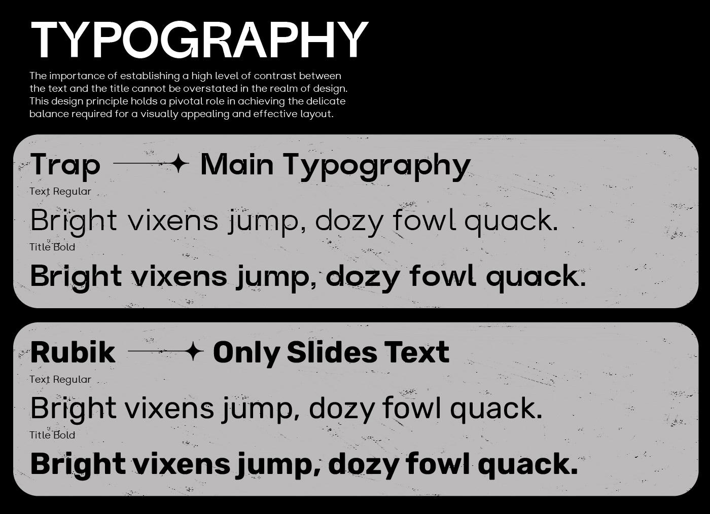
Inspired by my fascination with minimalistic typography and geometric designs,
they've invited me to reinterpret their core values through my creative lens.
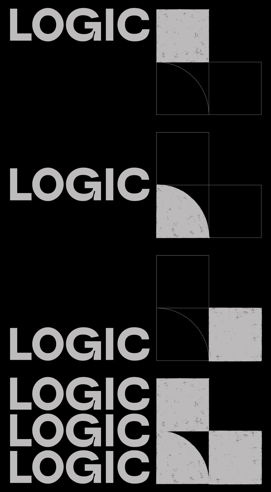
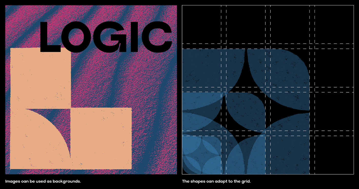
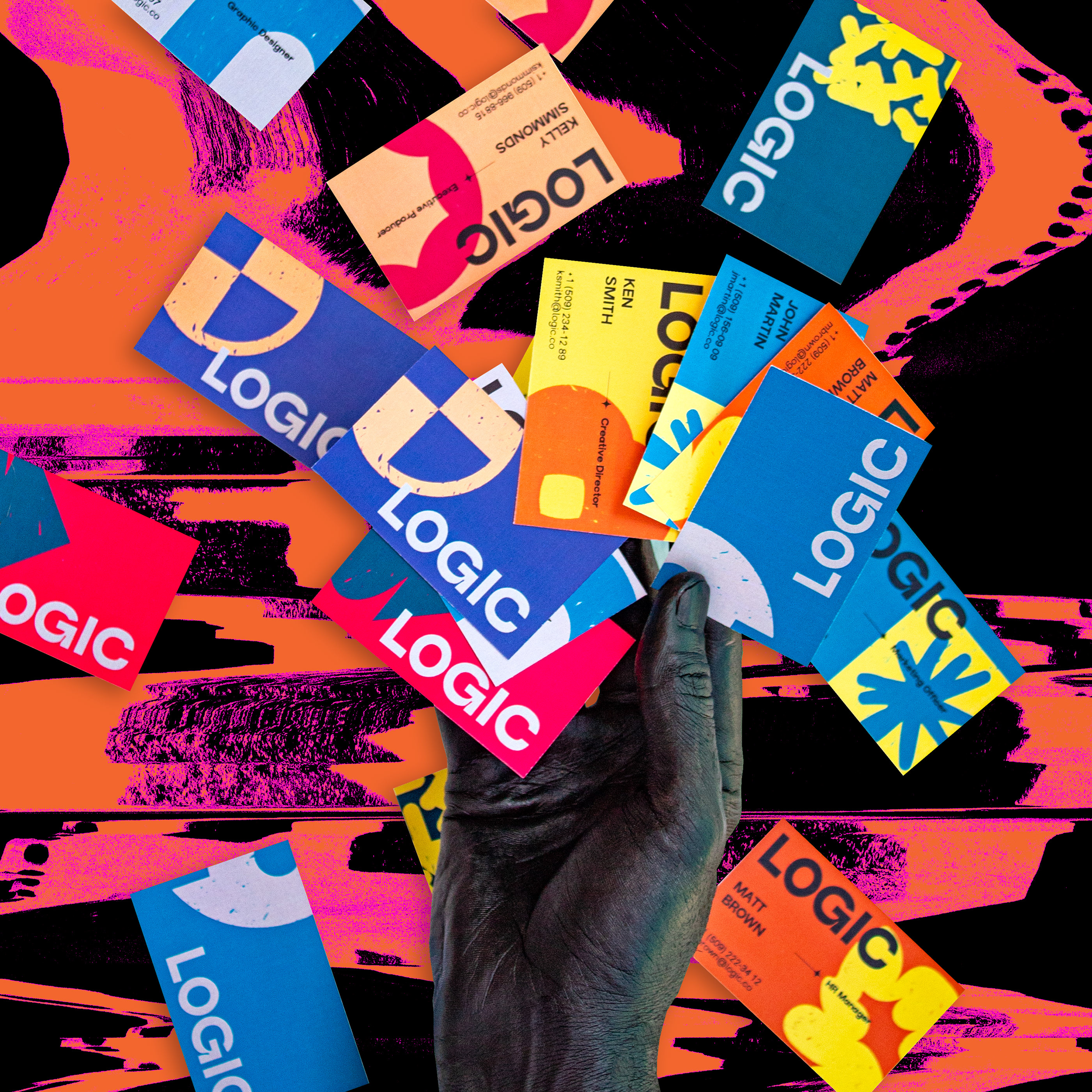
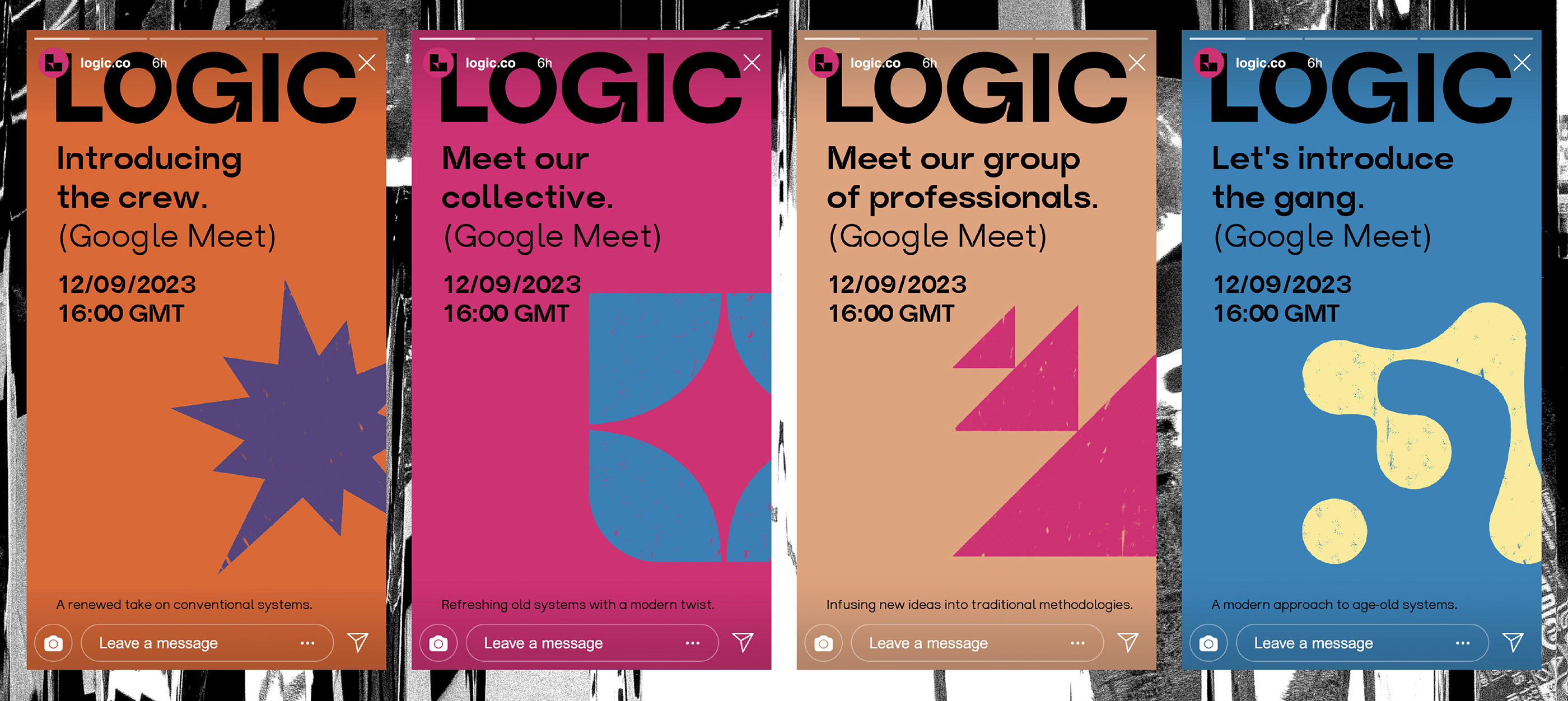
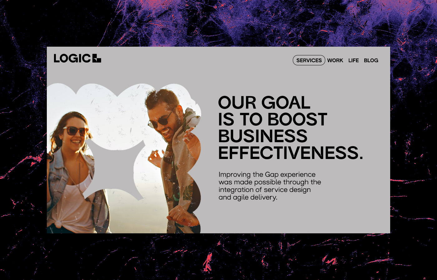
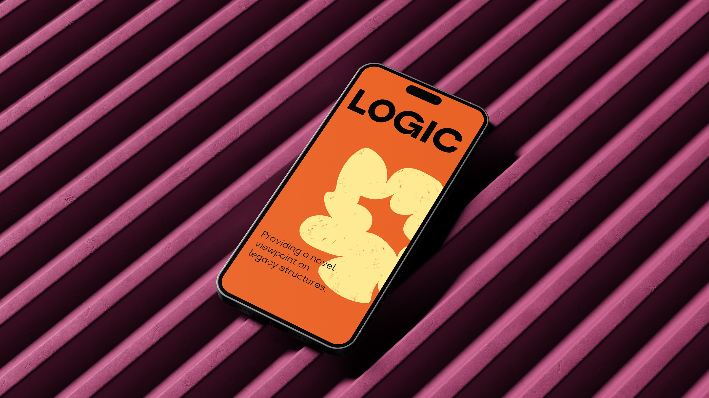
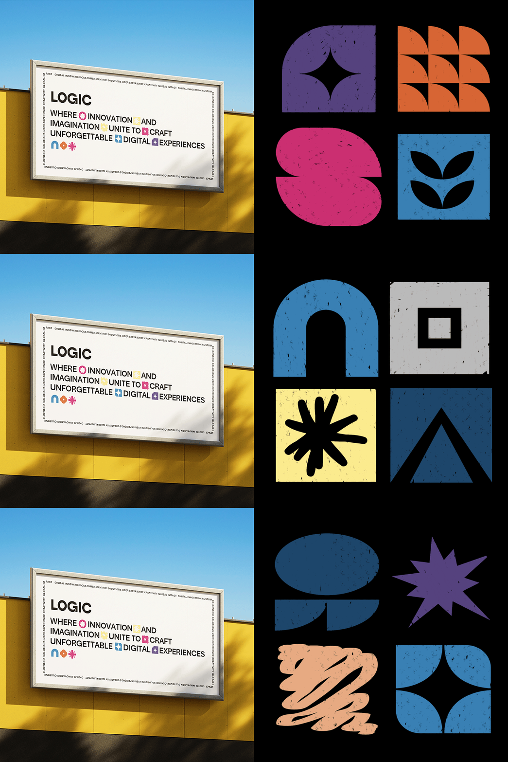
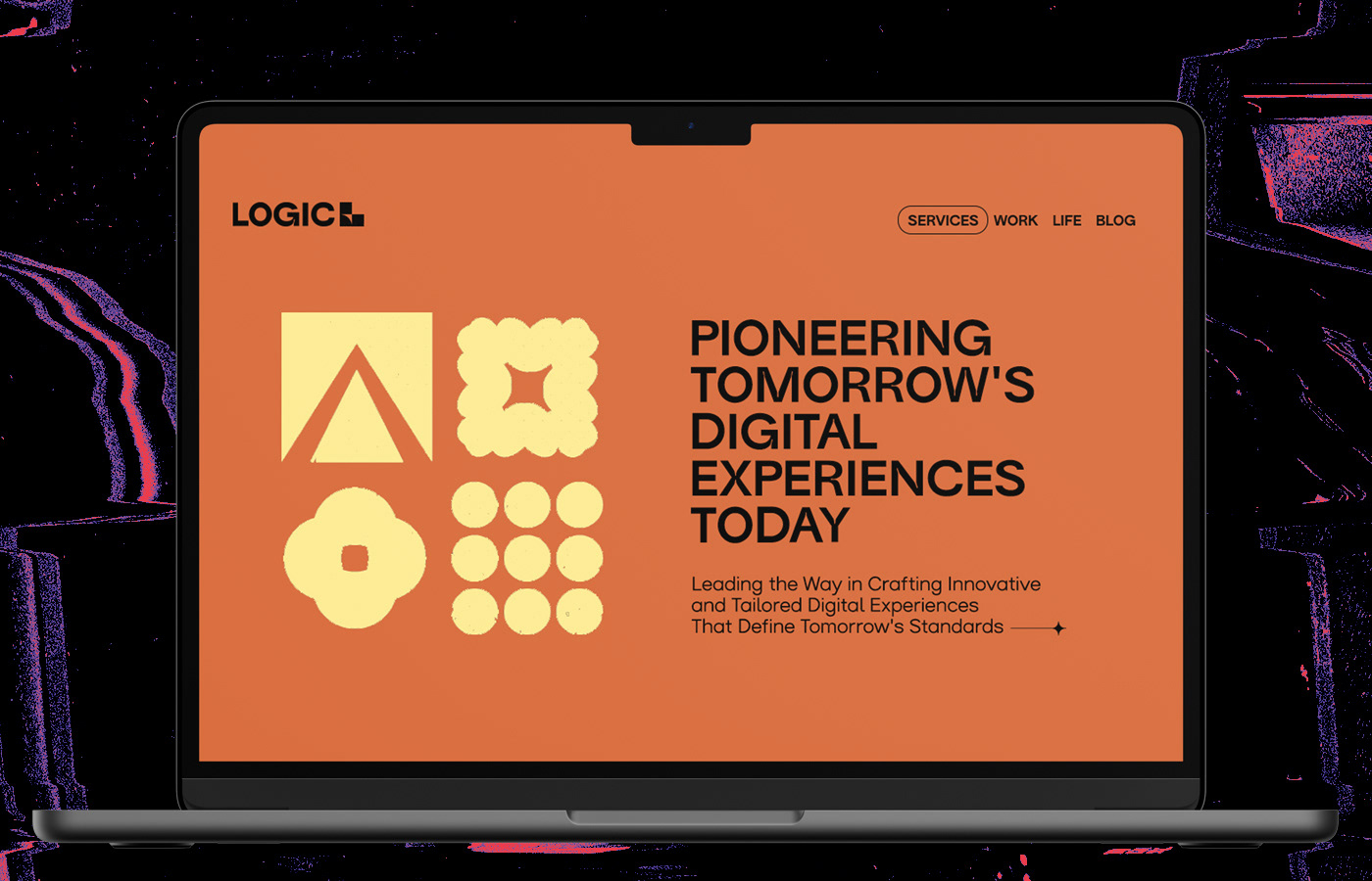
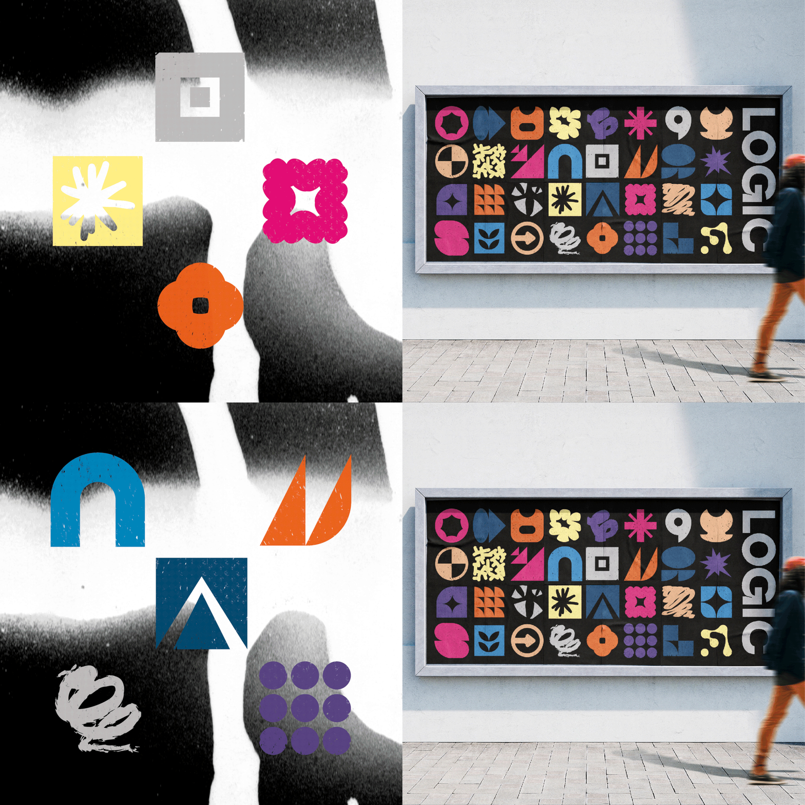
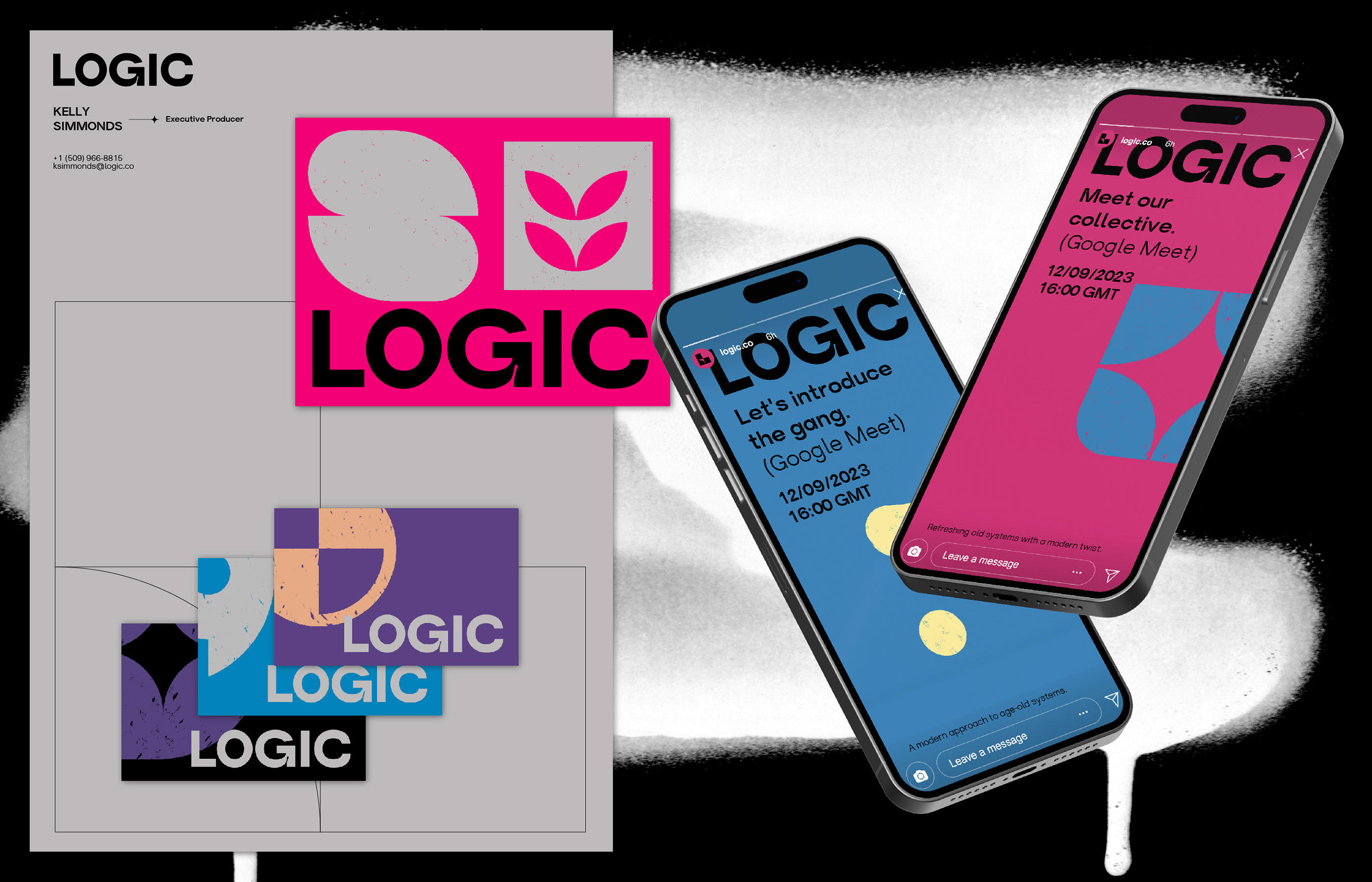
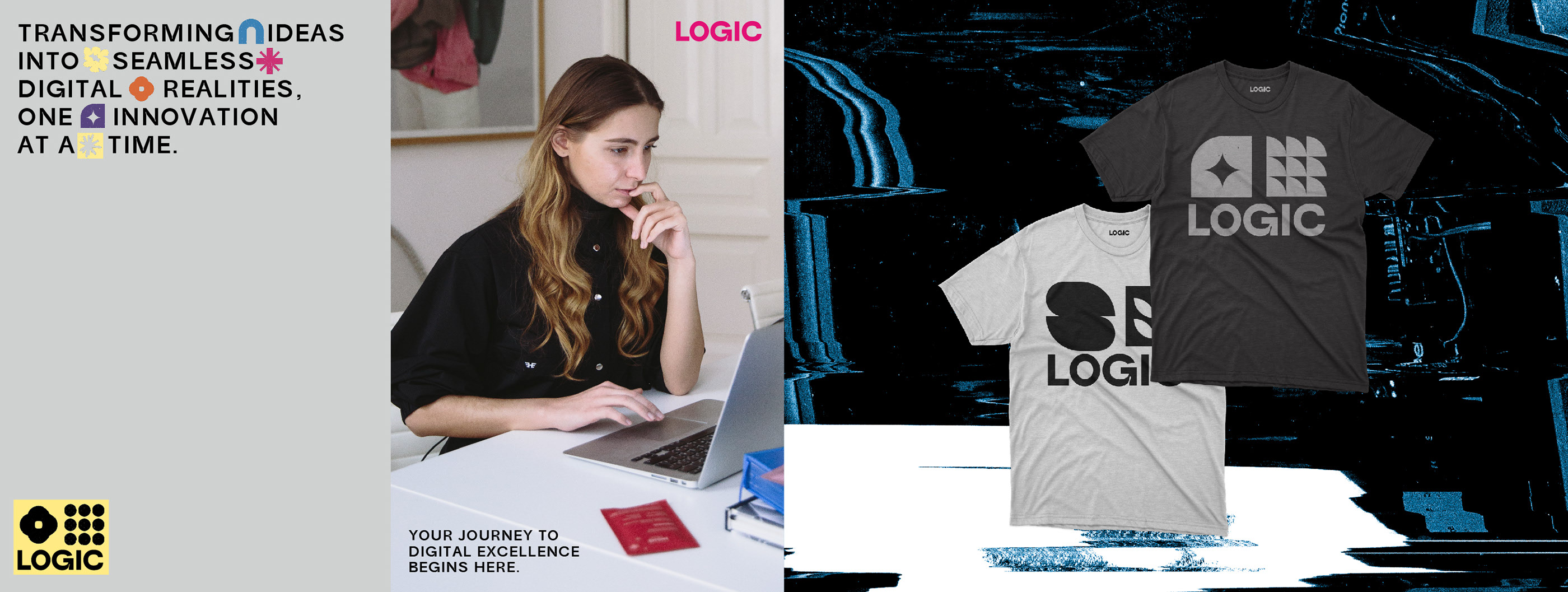
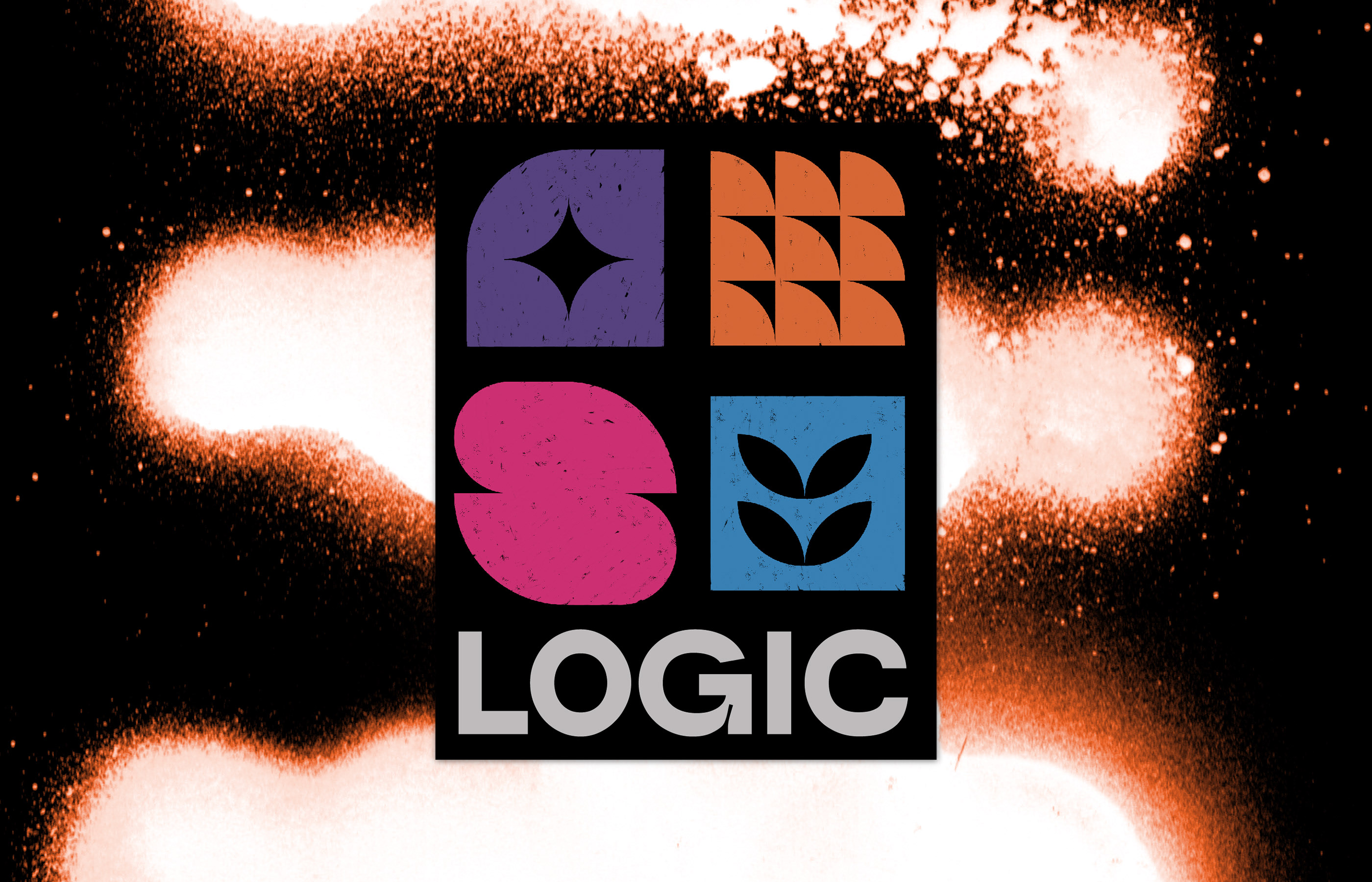
As a result, I've crafted a comprehensive guideline featuring a versatile set of
geometric shapes that seamlessly interact with each other. This innovative framework
offers an almost boundless array of solutions to meet their diverse needs, all
while maintaining a consistent visual identity. These geometric shapes also serve
as versatile containers for content, enabling to highlight different
sections
with clarity and hierarchy.




Client: LOGIC.CO
Year: 2023
An American company known for its cutting-edge digital solutions, has enlisted me to reinvent their brand identity. Drawing from my passion for minimalistic typography and geometric designs, I've created a versatile framework of geometric shapes that ensures a consistent and innovative visual identity.

